curiously common chandeliers


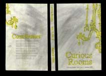
Elegant one on the left, photograph by Tim Davis; messy rendition on the right, beginning graphic design student’s idea for a cover, 1999
Just thought it was interesting, the chandelier image combined with the color yellow; and how he was able to achieve something close to the vision I had in mind at that time, and was unable to achieve. Although I really wanted the chandelier to seem like it was dripping or disintegrating.