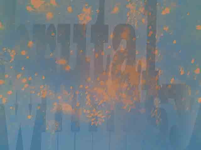
brutal whimsy
Not totally happy about the font, but I needed one where the letters didn’t fight with each other too much across the lines. It would have been nice if the verticals on the letters lined up, but they don’t in this phrase. A non-proportional font was one option, but I ended up with this. The blocky serifs seemed to help integrate them. Then I learned how to use the Layer Style to adjust the bevel(?) direction. Although there is no bevel. The bevel setting is pushed to the maximum.
The y is a separate type layer because I didn’t want the hanging descender. So the y is resized to fit the line. Also adjusted the bevel direction on the y to help it fit the flow. It’s got a little too much light coming from the right side, but that seemed the best of possible options.
As far as Hue, I could have made this a green background with red lights on it, but it looked inescapably like a crime scene. Too much for me. Orange on blue seemed more peaceful.
